7 Websites that Prove Clarity Beats Cleverness
As Daniel Kahneman and Amos Tversky famously noted, people don’t choose between things, they choose between descriptions of things. Yet if you take a few minutes to visit a few of your competitor’s websites, you’ll notice how few of them clearly articulate what’s actually for sale within the first few seconds. If it’s confusing for you to grasp what’s on offer, imagine how frustrating it is for potential customers.
Articulating a compelling proposition using the written word is an art form that has been eroded over time. In years gone by, traditional advertising space was so expensive, a copywriter’s role was to craft short, memorable sales messaging using as fewer words as possible. Paying per word, literally, forced ad men to be economical and creative with the language they used.
Online, however, there’s no need to keep it short. In fact, we’re encouraged at every turn to write more copy rather than less, because that’s what Google likes. And after all, in the digital world, it doesn’t cost us more to use five hundred words instead of five.
Except, of course, it does.
It costs us dearly in lost business that we may have won, had we put ourselves in the shoes of a new customer who is short on time and patience.
For inspiration, here are 7 websites that deliver clear, powerful messaging that cannot be misunderstood.
Floom - Florist Marketplace
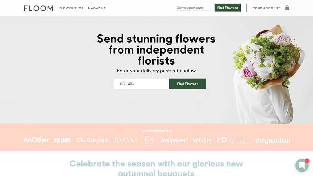
If you want to send flowers to someone that lives in a different town, how do you find a florist that is local, good quality, and can take payments online? Floom has taken this problem away and has built relationships with the best independent florists in the UK, listed their various flower arrangements online and hooked up a super quick, convenient payment and delivery platform. A great concept with a perfect one-liner to sum up the proposition: ‘Send Stunning Flowers From Independent Florists’. Got it.
Ollie - Tailored Dog Food
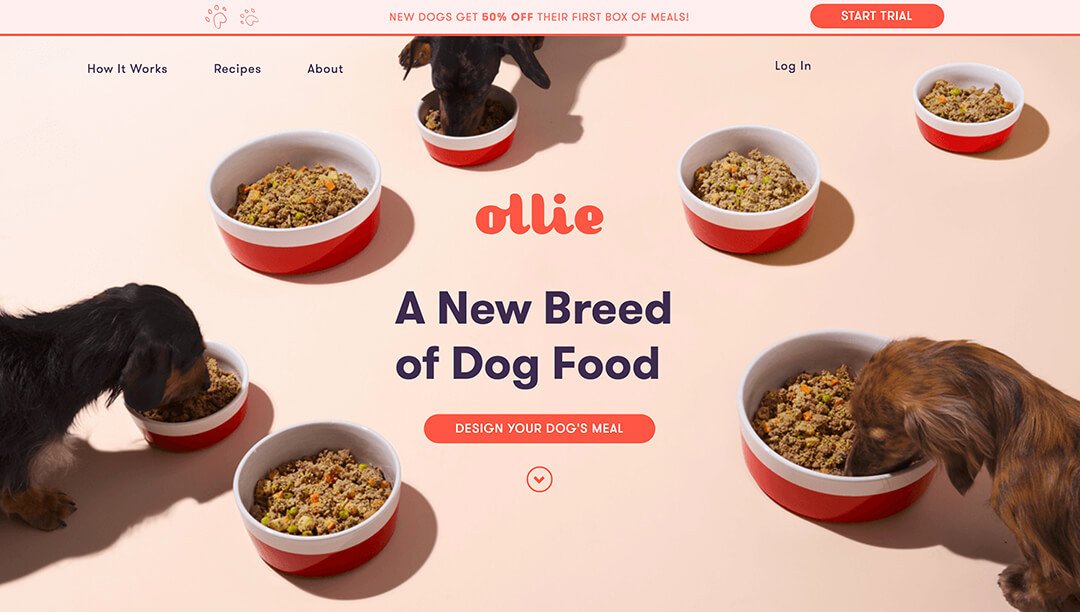
People think of their dogs as part of the family and genuinely care about their wellbeing and nutrition. Ollie is a subscription service that delivers fresh dog food, tailored for your particular pooch. The website design keeps it friendly and simple while the copy does the heavy lifting. Although not a fan of puns, ‘A New Breed of Dog Food’ is actually very clear. It tells you that it’s dog food but not as you know it. It’s the button text however, that really nails it: ‘Design Your Dog’s Meal.‘ In four words you understand the entire service and what to expect next. Top marks.
Habito - Online Mortgage Advisor
The instant chat website format is becoming ever more popular, but it’s the copywriting that makes this site stand out. The world of finance, and mortgages, in particular, is not traditionally plain speaking. But what could be misunderstood about an opening gambit that says: ‘Hello, I’m a Digital Mortgage Advisor’ and goes on to explain that after you give a few details you’ll get some mortgage recommendations, for free, within a few minutes. It’s not particularly short, but it is clear, and every carefully selected word has a purpose.
World Wildlife Foundation - Charity
The thing that we love about the WWF homepage (as well the adorable Koala) is the Zen-like level of discipline and restraint that has been shown. With an organisation this size, that has so many initiatives to shout about, it would be so easy to go off in a million directions at once, confusing and losing visitors. However, by leading with a clear, simple offer to adopt a Koala, rather than asking for a generic ‘donation’, new website visitors are met with a clear proposition that clarifies, in one example, exactly what the organisation does – as well as converting visitors into contributors. Other charities should take note.
Impossible Foods - Plant Burgers
This is an unusual one in that the headline is actually not that clear at all. But it intrigues and compels you to read the sentence below. What’s so impossible about a burger? Why is it impossible? Then you read the next line and at all makes sense: ‘It’s here. A delicious burger made entirely from plants.’ Note the use of ‘It’s here.’ – which cleverly assumes that this is something you and the rest of the world have been waiting for. Within 5 seconds of arriving you’ve been intrigued and educated.
Wealth Simple - Investing Made Easy
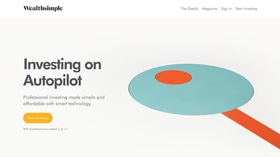
Wealth Simple takes the prize for explaining a complex service in the fewest words possible. ‘Investing on Autopilot’ couldn’t be any easier to understand and concisely explains the product and the main benefit in just three words. Hats off to the copywriter who clearly understands that less is more. Incidentally, the copy throughout the site is a masterclass in how to write in a way that feels both personal and professional at the same time.
Pink Ribbon - Breast Cancer Awareness
This is a great example of how copy can be used to amplify a hard-hitting message. The Pink Ribbon website uses images of real women with one breast showing, with a simple line of copy urging women everywhere to ‘Check it Before it’s Removed.’ Notice, that because of the high impact image, the copy doesn’t even mention what you need to check, or even include the words breast, cancer or awareness. The image grabs you, then just five carefully selected words do the rest.
What comes through loud and clear with these examples, is that clarity of message should be your absolute priority when it comes to your website. So many sites look great but fail to answer the 3 most important questions any new website visitor has:
What do you do?
What’s in it for me?
What do I do next?
If your website answers these 3 questions in the first 5 seconds, you’re already streets ahead of your competition.


